International counselors were coordinating opportunities through crowded inboxes, disconnected calendars, and manual sharing workflows.
← All projects
Case study 01 / Global guidance platform
Millie Group
Transforming a fragmented, email-dependent process into a unified dashboard for international school counselors and students.
- Role
- UX Researcher + Designer
- Duration
- 3 months
- Status
- Completed
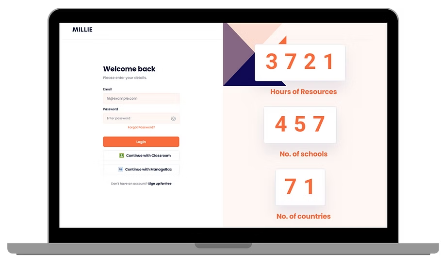
Case study at a glance
The essentials,
before the details.
Within a team, I contributed to international user research, synthesis, persona and journey mapping, concept critique, and the focused dashboard direction.
Interviews with students and counselors across regions exposed three recurring issues: counselor overload, low student attention to email, and no shared source of truth.
The concept replaced a fragmented multi-step workflow with one self-service dashboard for discovering, scheduling, and sharing opportunities.
01 / The challenge
Valuable opportunities were disappearing inside crowded inboxes.
Millie Group provides SAT preparation, university counseling, and career events to students around the world. Yet student participation was dropping drastically because the organization relied almost entirely on email campaigns to promote its programs.
Counselors spent hours coordinating links and schedules by hand, while students missed career workshops because the messages were buried or never opened. Our team was brought in to uncover the cause of this communication breakdown and design a digital ecosystem that could bridge the gap.
Core problem
Students and counselors lacked one effective place to discover events, manage schedules, and communicate - reducing engagement and slowing down the counseling process.
02 / Discovery
A global problem required research beyond local assumptions.
Over one intensive week, we coordinated interviews with students and international school counselors across multiple time zones. The goal was to understand the experience across different regions, academic calendars, and communication habits.
Counselor overload
Counselors were juggling mismatched calendars, different student interests, and several disconnected tools. Waiting days for mentor replies made event coordination slow.
Email was the wrong channel
Students viewed email as a place for formal school administration, not extracurricular discovery. Many did not know Millie's career workshops existed.
No central source of truth
Without a self-service hub, counselors had to download flyers, copy links, and move information manually between Millie and the platforms students used.
03 / Synthesis
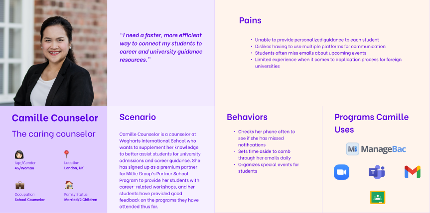
Meet Camille, the counselor at the center of our decisions.
We grouped interview findings in an affinity map, then created a persona and journey map. Camille Counselor represents a dedicated international school counselor trying to connect students with university and career guidance while managing tools such as ManageBac, Zoom, Teams, Gmail, and Google Classroom.
Camille needed a faster way to discover relevant opportunities, coordinate schedules, and distribute information without adding another layer of administrative work.
04 / Mapping friction
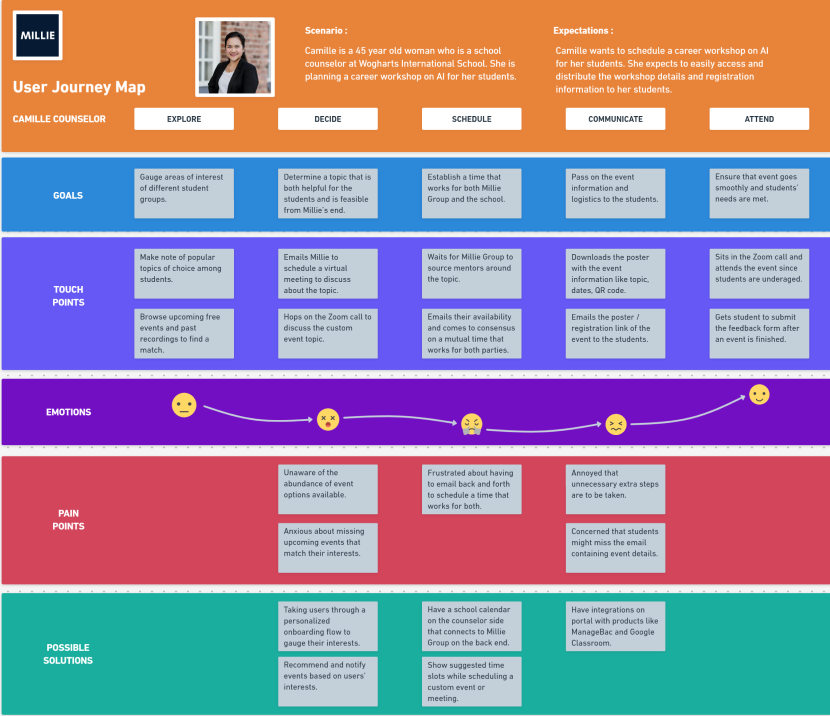
Her emotional low point happened before an event was even scheduled.
Camille felt anxious and unaware of the full range of events that could match her students' interests.
Her frustration peaked during long email chains used to compare school and mentor availability.
She manually downloaded assets, copied registration links, and worried that the message would still be ignored.
How might we
Create a unified dashboard that streamlines communication, simplifies scheduling, and increases student responsiveness?
05 / Design evolution
The first idea failed - and that became the turning point.
We began with a fast-paced design studio and sketched multiple interface directions. Our early concepts relied on layered navigation tabs and separate communication centers. During internal critique, we compared the screens with Camille's real workflow and realized the system was far too complex for a busy counselor to read at a glance.
Instead of forcing the concept forward, we stripped away the administrative clutter. The new direction used a flatter dashboard organized around two priorities: immediate scheduling visibility and direct action.
BeforeLayered navigationSeparate communicationAdministrative clutter
→AfterOne dashboardVisible schedulingDirect actions
06 / Final solution
One command center for counselors. A clearer path to students.
After refining the sketches, we created structural grayscale wireframes and then an end-to-end high-fidelity prototype. The dashboard became a single source of truth for upcoming opportunities, available schedule slots, and workshop coordination.
Schedule without the email chain.
Review career opportunities, compare open calendar slots, and schedule custom workshops from one place.
Receive opportunities where attention already exists.
Counselors can share event information through platforms such as ManageBac and Google Classroom instead of relying on email alone.
Project walkthroughs
The Millie concept in motion.
Both videos come directly from the Millie Group project folder and show the work connected to this case study.
Impact + reflection
We transformed a multi-day administrative process into a focused self-service platform.
The most important lesson was the value of critique. Letting go of our first concept allowed us to create a cleaner product that better reflected counselors' time, responsibilities, and global working conditions.