Learners frequently reached the end of a course without a clear, relevant next step toward their larger learning goal.
← All projects
Case study 02 / Learning platform redesign
Coursera
Helping learners find a meaningful next step instead of reaching a dead end after completing a course.
- Role
- UX Researcher
- Duration
- 2 weeks
- Status
- Completed
Case study at a glance
The essentials,
before the details.
Within a team, I contributed interview planning, affinity mapping, comparative analysis, persona and flow development, prototype evaluation, and usability testing.
Six participants completed two task flows. Seven first-round misclicks identified the screens that needed clearer hierarchy and interaction cues.
After iteration, participants completed the revised flow in under one minute without visible struggle and described it as feeling like a real app.
01 / Project overview
The course ended. The learning journey did too.
Coursera does a wonderful job of educating people in new topics. Each course is designed to help learners move toward a goal, but our research revealed a gap after completion: students often did not know what to do next.
Our challenge was to redesign one existing feature and create an entirely new one. We focused on helping learners discover relevant courses, personalize their experience, and continue building knowledge after a course ended.
The opportunity
How might we help learners discover relevant courses and confidently choose the next step in their learning journey?
02 / Discover
We started by listening to experienced Coursera users.
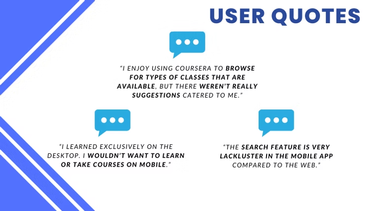
At first, our team was completely stumped. We did not want to assume that our own ideas represented what learners needed, so we changed our approach and began with user interviews.
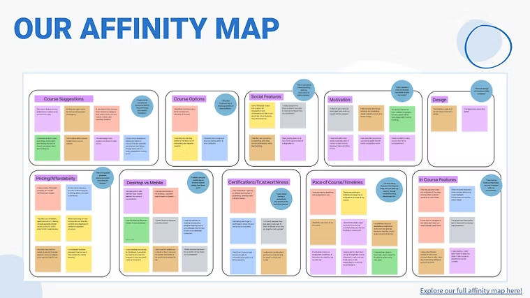
We carefully developed open-ended questions that gave participants room to describe their behavior and frustrations. After the final interview, we brought the responses into an affinity map so we could find repeated patterns rather than reacting to isolated comments.
What we learned
Users struggled to find courses that felt relevant, wanted better recommendations, and often felt unsure about what to learn after completing a course.
03 / Define
Turning patterns into a person, a journey, and a clear problem.
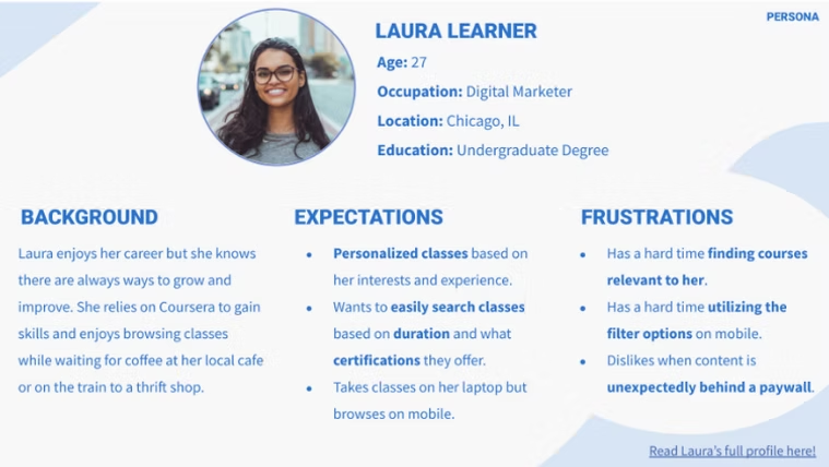
We created Laura Learner, a persona grounded in the interview patterns. Laura helped us keep the project focused on a real learner's goals: search across subjects, build a curated learning path, and take classes on any device.
From there, we mapped the learning journey and wrote our problem statement and How Might We question. The process made one idea especially clear: recommendations were not just a discovery feature. They were the bridge between completing one course and reaching a longer-term goal.
04 / Analyze + map
We looked beyond education products for useful interaction patterns.
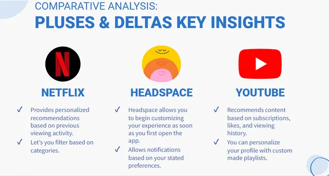
Competitive and comparative analysis gave our team a different perspective. Netflix demonstrated personalized recommendations, Headspace showed how to begin personalizing immediately, and YouTube showed the value of content based on subscriptions and viewing history.
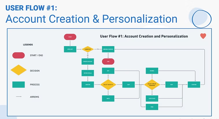
We translated those observations into a user flow for account creation and personalization. Mapping the flow before designing screens helped us connect onboarding choices to the recommendations learners would eventually receive.
05 / Ideate
Sketching helped the team think together before committing to pixels.
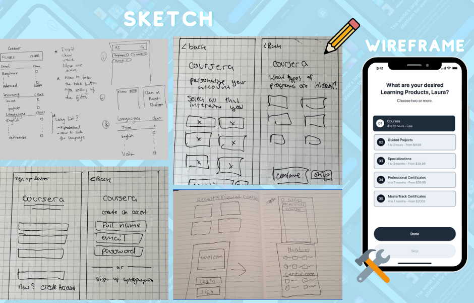
After a long research phase, sketching gave us the freedom to explore quickly, change direction, and understand one another's ideas. Once we agreed on the strongest layout, we moved into wireframes and translated the paper concepts into a digital structure.
06 / Prototype
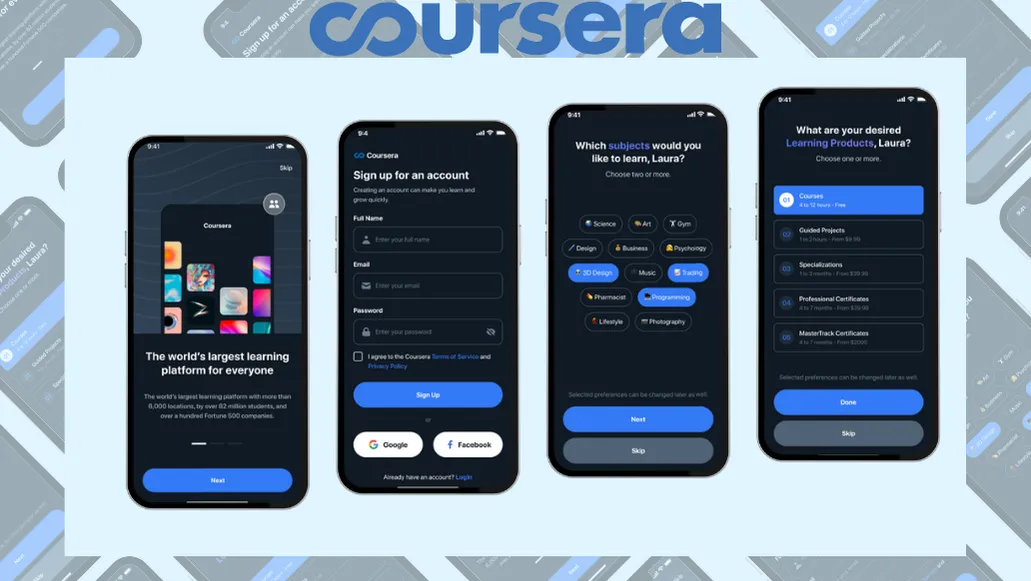
The first prototype connected onboarding, discovery, and encouragement.
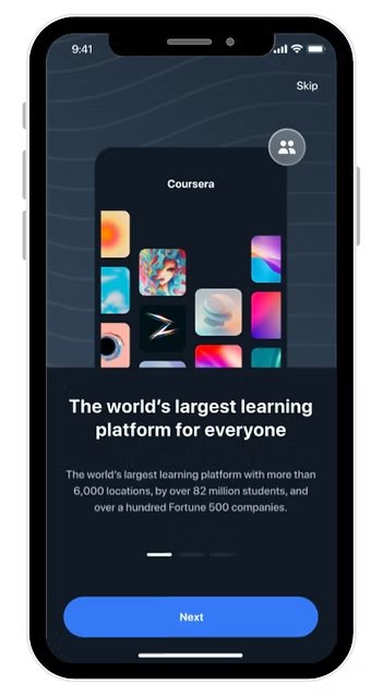
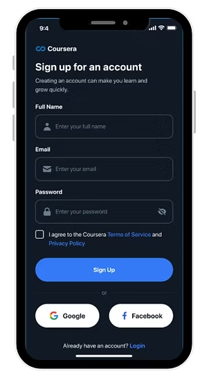
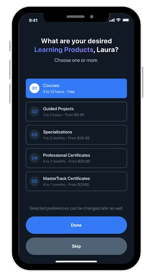
The prototype included loading, encouragement, sign-up, login, course, subject, home, and search screens. We designed the mid-fidelity experience to feel realistic and smooth while using a dark visual direction that supported the product's focused learning environment.
07 / Test + iterate
Seven misclicks showed us exactly where to improve.
Six participants completed two task flows. First, they created and personalized an account for free courses in 3D design, trading, and programming. Then they searched for highly rated science classes that could be completed in under one month.
Our target was completion in under two minutes with no more than one error. Most participants met the time goal, but the first round produced seven misclicks across the six users. We returned to the screens with the most friction, kept the successful structure, and added clearer color, style, and interaction cues.
6participants
7first-round misclicks
< 1 minsecond-round completion
Second-round result
Participants moved through the revised prototype in under one minute, did not show visible signs of struggle, and described the experience as feeling like a real app.
Prototype walkthrough
See the Coursera flow in motion.
This is the project-specific prototype video supplied with the Coursera case-study materials.
Final result
Research gave the team a problem worth solving. Testing gave us the proof and direction to improve it.
We completed a clickable redesign that connected personalization, search, course discovery, and next-course recommendations. The second round confirmed that the revised interaction was faster and easier to understand.