The brand had a memorable identity, but shoppers lacked a complete, responsive path for browsing products, signing in, purchasing, and gifting.
← All projects
Case study 03 / Responsive e-commerce redesign
Besfren Beauty
Creating a modern K-beauty shopping experience built around easy browsing, checkout, and thoughtful gifting.
- Role
- UX Researcher
- Duration
- 2 weeks
- Status
- Ongoing
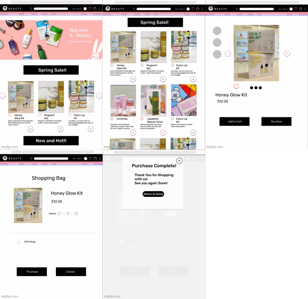
Case study at a glance
The essentials,
before the details.
I independently audited the existing experience, conducted information-architecture research, mapped the purchase flow, designed the responsive storefront, and tested the prototype.
Five online shoppers completed the purchase task in under three minutes. Their behavior revealed login as the clearest point of friction.
The redesign created a recognizable but more functional storefront with product discovery, checkout, account, and gift-wrap paths, plus a focused next iteration.
01 / Project overview
A memorable brand without a complete online shopping experience.
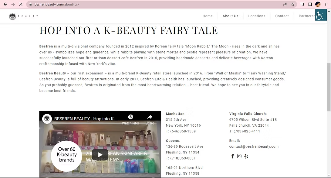
Besfren Beauty is a fresh Korean beauty shop with a playful identity and strong potential. The original site introduced the company and its locations, but visitors did not have a clear way to browse, sign in, purchase products, or move comfortably between desktop and mobile.
My responsibility was to redesign the website and create an online shopping experience that felt modern without losing the personality of the existing brand.
Problem statement
Lisa needs a quick and easy way to navigate the website so she can purchase gifts online without friction.
02 / Audit + scope
Preserve the personality. Rebuild the shopping structure.
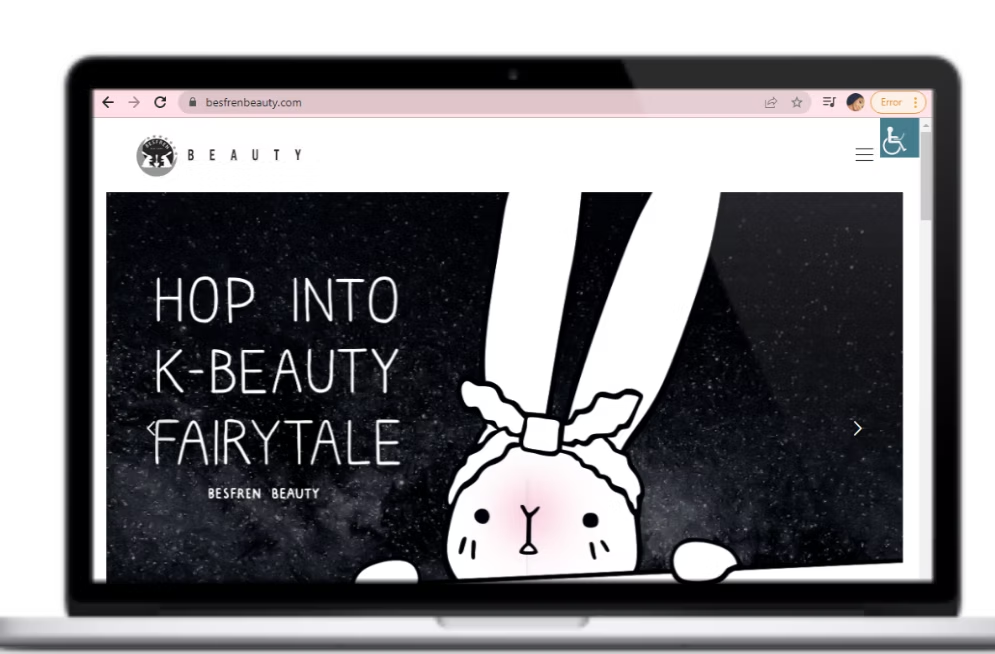
I began by reviewing the original website and learning about its products. The goal was not to create something disconnected from the company; it was to develop a new and modern experience that still felt recognizable.
03 / Research
The research focused on comfort, speed, and the way people organize products.
I used card sorting to understand how people grouped products, then created a problem statement, How Might We questions, competitive and comparative analysis, a journey map, sketches, a user flow, and a sitemap.
The journey centered on an everyday shopper searching for a gift for a best friend. Mapping the path from search to sign-in, rewards, and checkout helped humanize what might otherwise look like a simple transaction.
How might we create a more personalized online shopping experience?
How might we make the purchase process straightforward for online shoppers?
How might the website feel as comfortable as shopping in person?
Key findings
Users needed an easy way to shop, a modern design that fit the brand, and a simpler path through login and checkout.
04 / Research to design
Every major need became a concrete part of the experience.
Search and product categories
Cart and checkout
Login setup
Gift-wrap selection
The gift-wrap option became the most valuable part of the minimum viable product. The target shopper often needed to buy a thoughtful gift quickly, so combining checkout and wrapping saved time while keeping the experience personal.
05 / Design
A colorful storefront brought the brand to life while keeping the layout familiar.
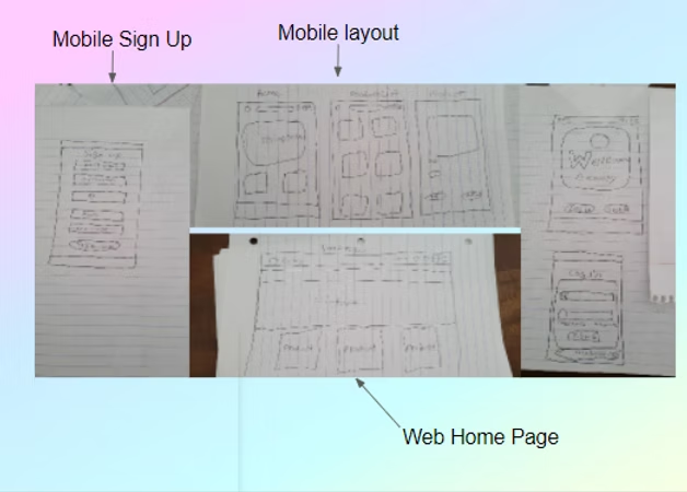
Sketching and concepting were my favorite stages of the project. I explored a fresh color palette and designed a product-forward homepage that allowed visitors to browse before logging in.
I also created a simple mobile concept that resembled the desktop site. Keeping the structure transferable made it easier for shoppers to move between devices without relearning the experience.
06 / Usability testing
Five shoppers completed the purchase flow - and login revealed the next iteration.
I tested the high-fidelity prototype with five people who were familiar with online shopping. Each participant was asked to log in and buy one item within a defined time and click limit.
Every participant completed the task in under three minutes with a low level of misclicks. The clearest friction occurred during login, giving me a focused improvement for the next version.
5online shoppers
< 3 mintask completion
1 focussimplify login
07 / Structure + learning
The flow and sitemap became maps for both the prototype and the test.
Creating the user flow helped me understand what checkout should look like and how the usability tasks should move through the prototype. The sitemap gave the product categories a clear home and reduced the chance that ideas would get lost while I built the screens.
Visual tone changes feeling
Color and theme strongly affected how fresh, lively, and inviting the store felt to shoppers.
People take different paths
Participants completed the same task in different ways and did not always use interface elements as expected.
Structure supports execution
The user flow and sitemap made the prototype easier to build and the testing scenario easier to evaluate.
Recommendations + next steps
The playful brand can support a clear shopping flow - with room to become even more personal.
Future iterations would simplify login, add product reviews and direct help, and introduce a rewards system for signed-in shoppers. Those features could encourage customers to build a profile and return to a more personalized experience.